Adding new medical data to a diagnostic report
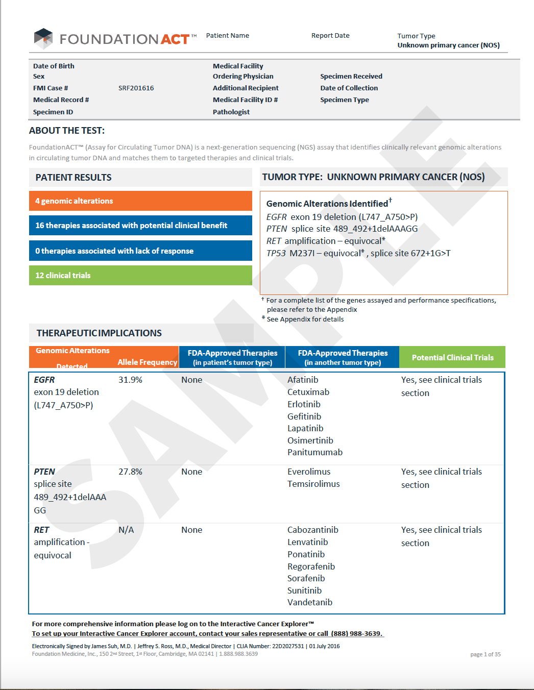
The Challenge A PM who owned the look and feel of a patient diagnostic report wanted to include a new graphic into diagnostic report data set. The current diagnostic report had only text and tabular data. The reports could be very short, or very long, depending on the diagnostic details from the patient sample tissue. We wanted to to come away with a grounded understanding of how oncologists and staff use diagnostic reports for patient diagnosis, especially when visual presentations were included and could show data for more than one date in time.
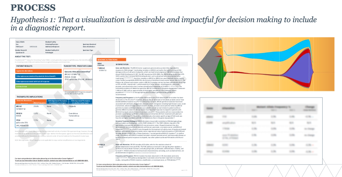
We came up with 4 different hypotheses that we wanted to test, that covered if graphical elements were involved, how important was it to include other tabular data, if oncologists wanted to see more than one instance of data at a time to use for trending or progress, what value there was in showing a comparison between two slightly different tests, and also better understand what kind of graphic would be best to include in the report. |
|
The ProcessThree separate user research studies were designed to look at our hypotheses. We used a mix of oncologists in a community or academic setting. The sessions were a combination of in person and remote moderated user research sessions.
|
|
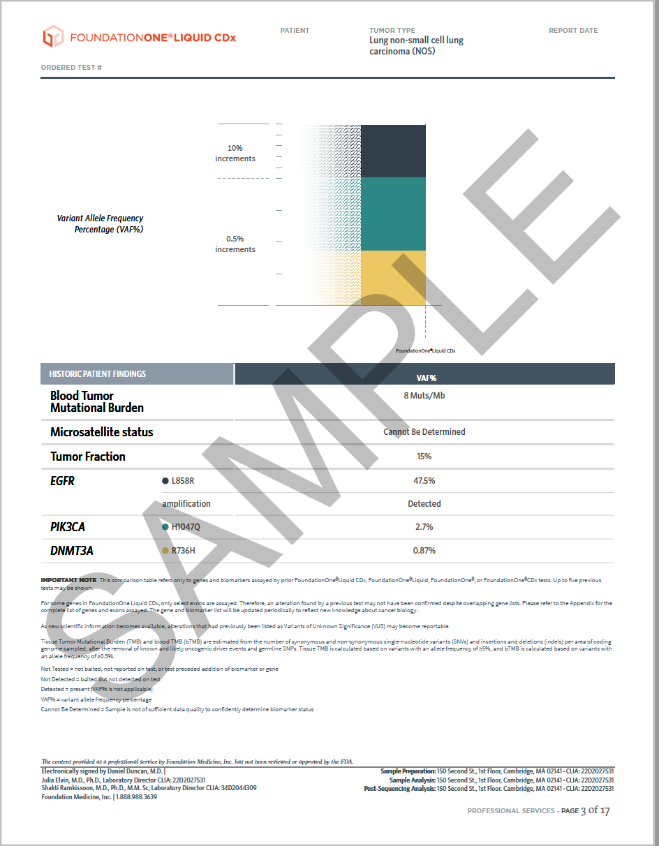
The ResultWhile some oncologists preferred to work with tabular data, the graphic did get enough traction to be included in the diagnostic report and we had recommendations on the type of graphic to use. Based on our findings, more research was built out to better understand the optimal graphical representation of data, given that it could vary greatly based on underlying patient data.
|
|
